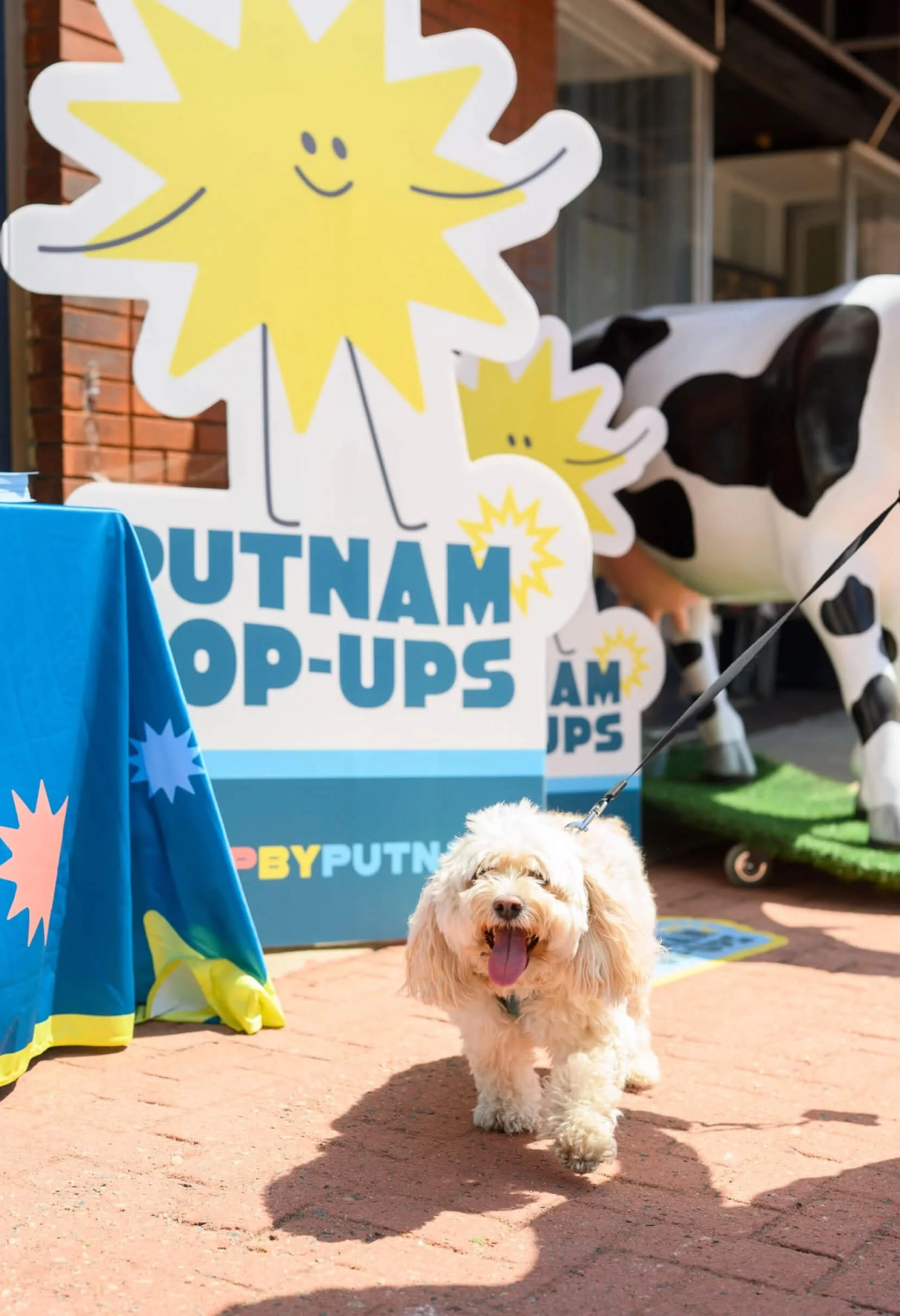
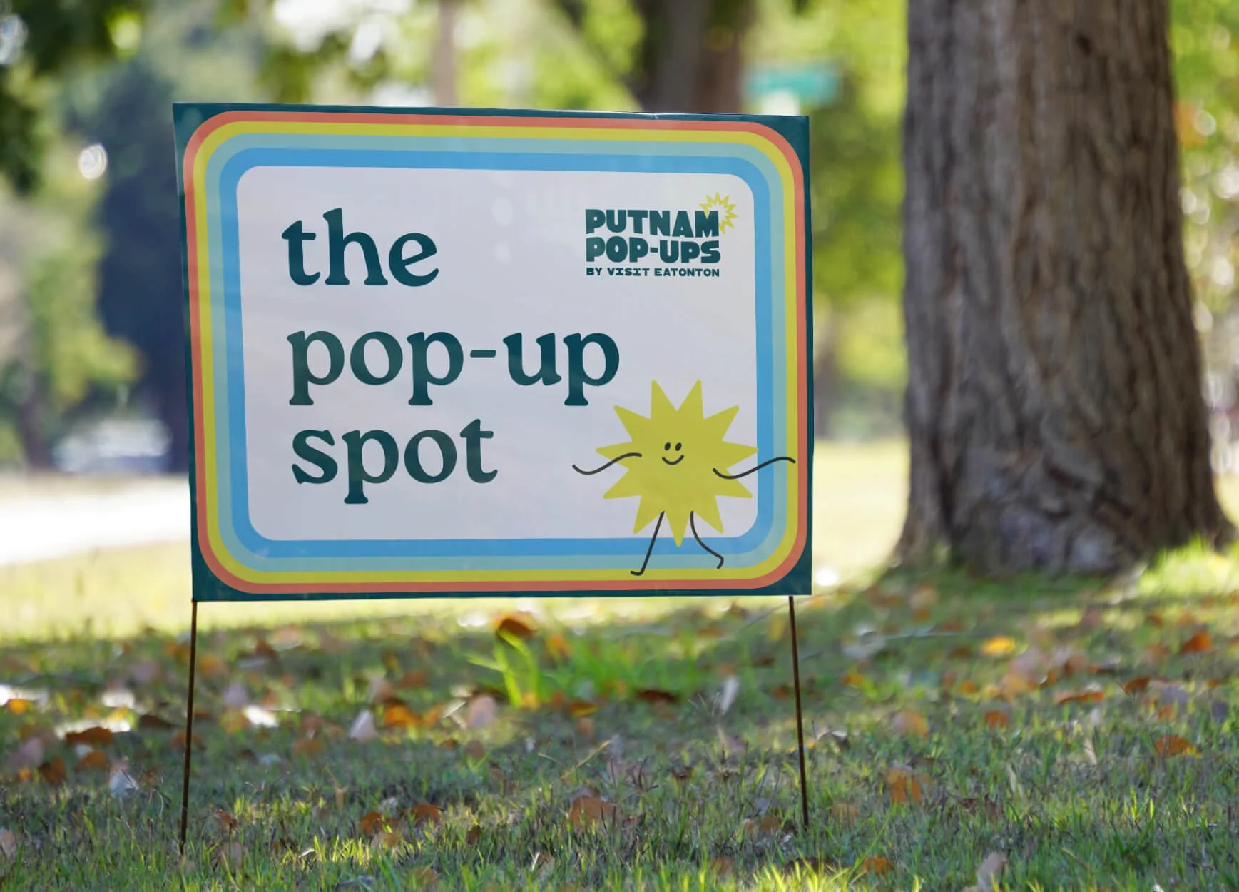
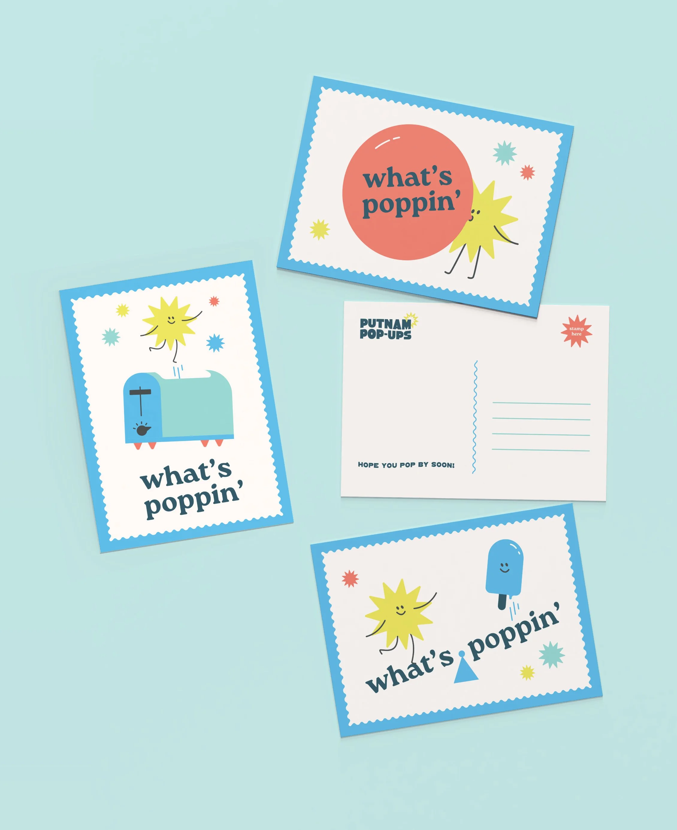
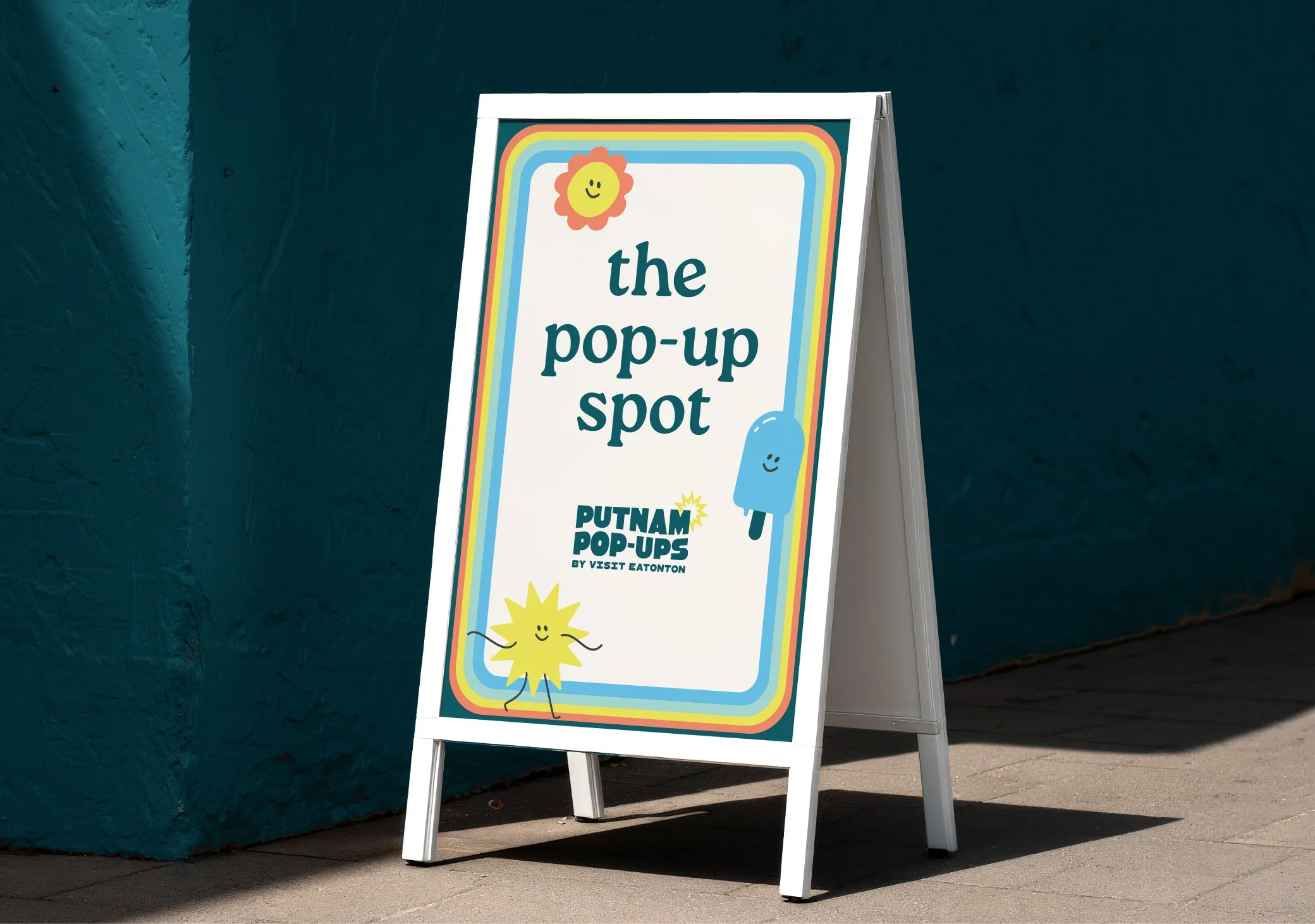
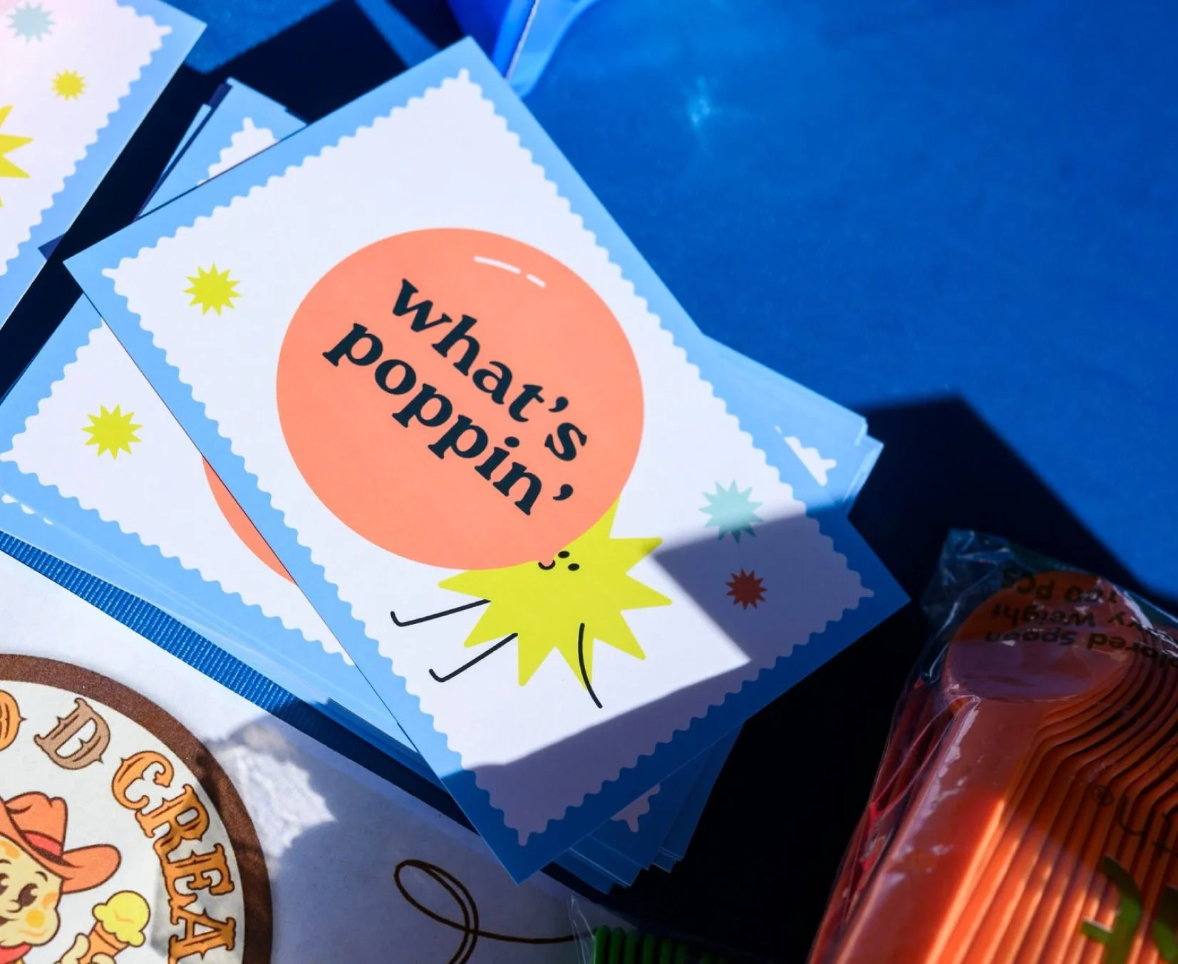
Putnam Pop-Ups
Eatonton, GA was ready to pop off. In a good way, of course! Their new sub-brand brings pop-up experiences to residents and visitors alike. Partnering with local businesses to engage the community, Putnam Pop-Ups delivers unexpected, family-friendly fun.
Roles - Designer, Motion Designer
Creative Director - Karen McKenzie
Account Executive, Copywriting - Lexi Johnson
Agency - Rhyme & Reason Design
LET’S GET IT POPPIN’
INITIAL DIRECTIONS
As the lead designer on this project, I created directions that stayed true to the brief, were mindful of the parent brand, and checked as many boxes off the client’s wishlist as possible. Some of those included:
Eye-catching and punchy, but not harsh
Potentially works in the parent brand’s primary color (dark teal)
Potentially hand-drawn vibes
If possible, work in a wave or water to nod to Eatonton’s lake shorelines
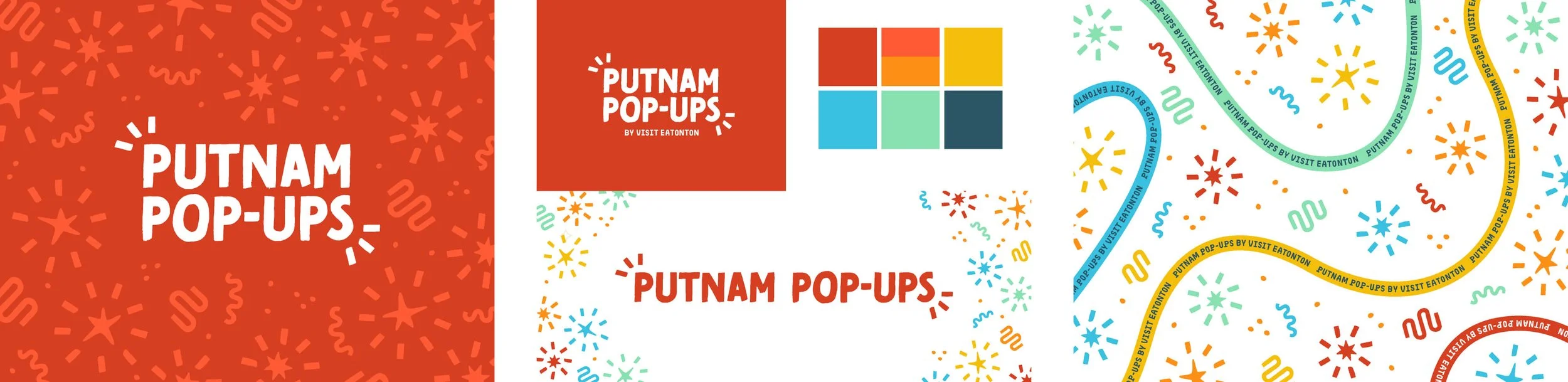
Direction 1: Bold & energized

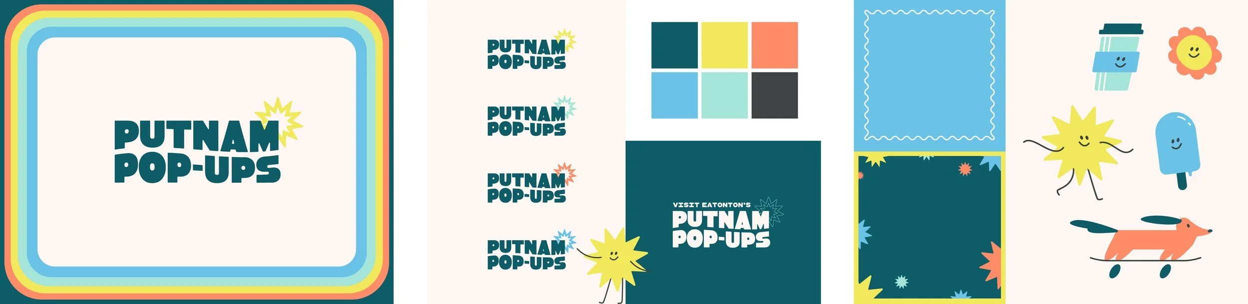
Direction 2: Handmade & vibrant
Direction 3: Fresh, fun, and with a wave worked into the type (our winner!)
THE BUILDOUT